Check out what's happening at Friendly HQ
Uber’s rebrand and what it means for UI design
by Ray
Uber has been copping flak recently for its 2016 brand overhaul and controversy. Despite that, I want to focus on an aspect which drew less attention - the site redesign. After working closely with The Friendly Agency’s Art Director Lorenzo Bocchi, I’ve come to appreciate the little details which make an intuitive UI delightful. Here’s a breakdown of specific elements which I believe will define user interfaces and delightful experiences in the future.
Page layout and structure
For the last few years, the web has seen a steady increase in sites with full-width images, large overlayed text and structures defined by horizontal blocks. This may work for certain industries (e.g. photographers) but when this layout is applied to every other business out there, all of a sudden information isn’t being efficiently communicated. It’s become formulaic enough that it can even be produced as a theme.
Nobody wants to pay for a bespoke design which looks the same, if not worse, than a Wordpress theme.
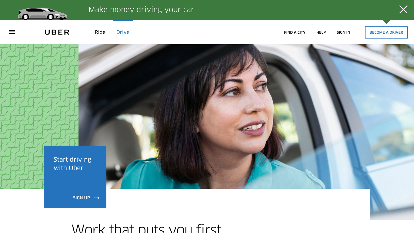
In Uber’s case, they evolved from that very formulaic design to a visual style that’s freeform. For instance, elements such as the “Start driving with Uber” call-to-action literally sits outside of other elements. Layered elements create visual interest, develops depth as well as hierarchy.
Another point to note is that they’ve moved away from full-width imagery and has set a maximum width on the container. With screens and resolutions only getting larger, full-width elements have begun to lose appeal over setting a maximum width. Larger images tend to blow out of proportion while potentially losing quality and increasing load time in the process. As a result, there’s less control over the composition and how the content is viewed. By setting a maximum width, it’s guaranteed that the user will see the interface the way it was meant to be structured.
Animation and micro-interactions
UI design has evolved to a stage where it doesn’t hurt to go the distance by turning a great interface into an enjoyable experience. This is done in Uber’s site through two general methods. The first is the transitions while navigating between pages and the second is animation.
Take video editing for example. Videos are shot, cut and edited in a way that ties content together seamlessly. The transition feels natural and the viewer doesn’t need to think twice about it. In the same way, navigating between pages shouldn’t require the page to completely disappear then flash back on while content loads itself. Think about how content transitions out of the page and how it transitions back in.

Uber tackles all three states in their branding site. Content moves onto the page, out of the page and in between is a loading animation - tied together seamlessly. In addition, layered elements react and animate to mouse interaction. This gives the user feedback that their actions cause reactions on the interface.
Don’t overdo it
Decisions should be objective driven in projects and animation shouldn’t be included for the sake of it. Take www.uber.com as an example. When compared to the branding site, there is much less animation between pages and on the pages themselves. Movement is at a minimum with parallax effects on the homepage and micro-interactions on buttons. It’s subtle and tasteful without affecting performance.
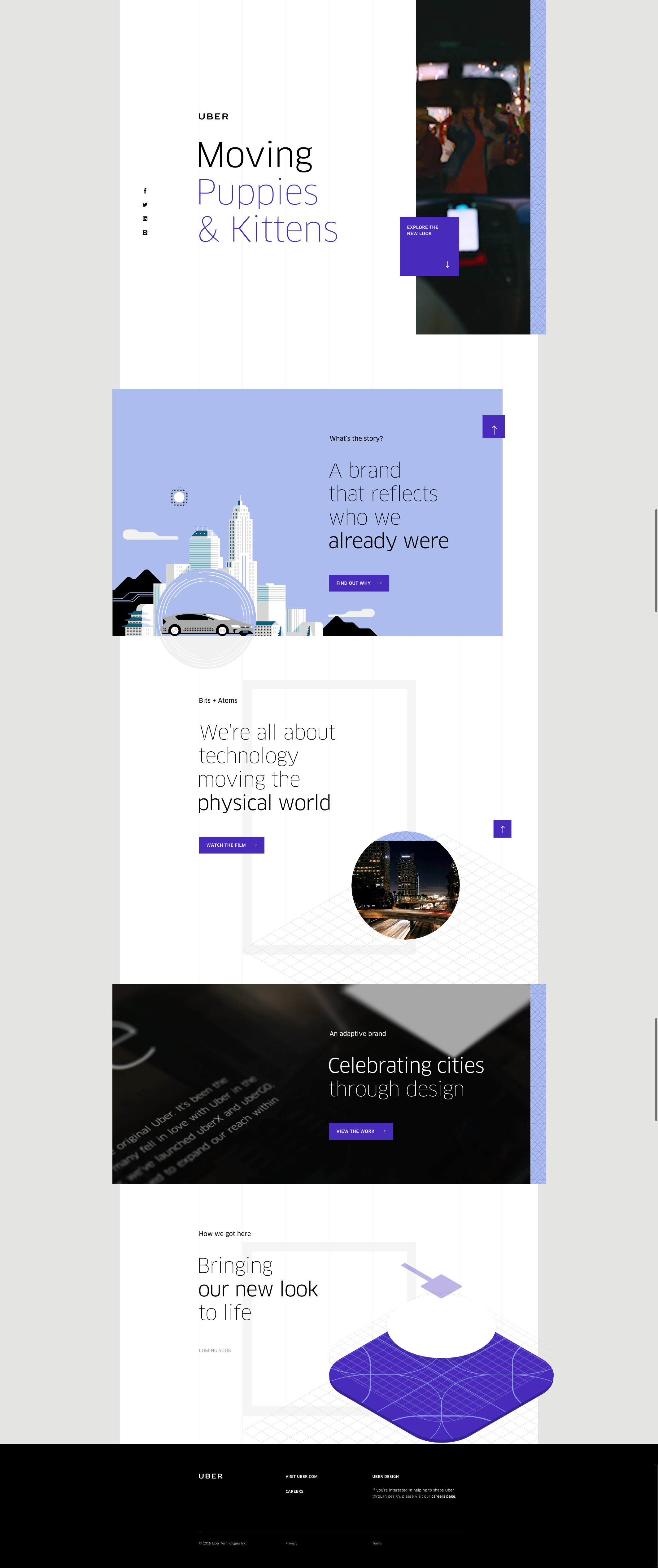
The branding site (brand.uber.com) on the other hand pulls all stops. Almost every element on the page animates or interacts. This might be an enjoyable first time experience but for returning users, the constant movement may become tiring.
Positive steps
Uber’s redesign is a positive step forward for tailored web experiences and it’s great to see more businesses break out of the trend of monotonous layouts. The definition of a great interface now includes bringing it to life through movement - naturally and delightfully.